Hulu's Data Visualization Identity
Hulu is a data-oriented company with hundreds of employees creating data visualization on a daily base. I came on board to design a data visualization style as well as creating tools for all Hulugans doing data visualization of internal and external use. This extensive project resulted in development of a color palette, color system, data visualisation style with a visualisation style guide, as well as a component library for the product design team.

A Comprehensive Color Palette
The color palette is comprised of a wide range of colors to compensate for all types of data visualization. The creation of the colors was a search for the sweet spot between accessibility and visual appearance.

Colors Created by a System
The color ranges are created through a system of overlaying pure white and black with increments of 15% opacity. With this system, all colors are in line with each other, and it makes it easier to extend the color palette if needed.
Fully Accessible
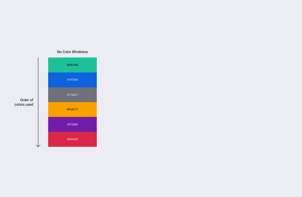
All colors are thoroughly tested for color blindness and following the WCAG guidelines.
An Extensive Color System
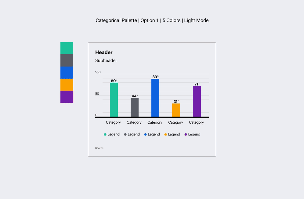
Besides a palette, I created a color system for every type of chart. The system includes the following palettes: utility palettes, palettes for categorical charts, palettes for sequential charts, palettes for diverging charts, and palettes for binary charts. With this system of 170+ color combinations, there is a custom palette for every type of chart generated.